- Informatii telefonice:(+40) 748 400 200
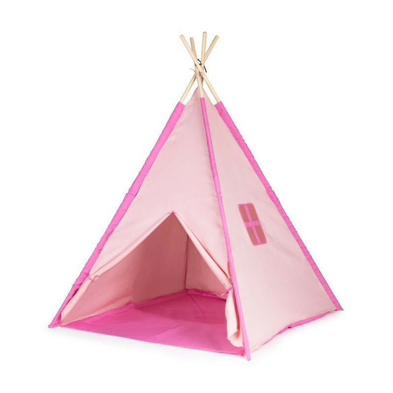
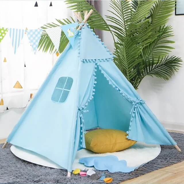
Cort tip indian pentru copii, Wigwam, 120 x 120 x 150 cm, Roz, EcoToys
Cod intern: xsales_36963591Producator: Ecotoys
Vizualizari: 9 / Achizitii: 11
Pret: 192.0 RON
Acest produs este publicat in categoria Ingrijire Copii la data de 10-11-2023: 03:11 si vandut de BabyNeeds. Vanzatorul isi asuma corectitudinea datelor publicate. ( alege finantarea potrivita )
-
Produs cu garantie
-
Livrare direct din stocul fizic al BabyNeeds
-
Retur gratuit minim 14 zile de la data achizitiei
.bd-grid { display: grid; display: grid; grid-template-columns: repeat(3, minmax(0, 1fr)); row-gap: 50px; column-gap: 50px; justify-items: center; text-align: center; } @media screen and (max-width: 600px) { .bd-grid { display: grid; grid-template-columns: repeat(1, minmax(0, 1fr)); } } .bd-grid-s { display: grid; display: grid; grid-template-columns: repeat(2, minmax(0, 1fr)); row-gap: 50px; column-gap: 50px; justify-items: center; text-align: center; align-items: center; } @media screen and (max-width: 600px) { .bd-grid-s { display: grid; grid-template-columns: repeat(1, minmax(0, 1fr)); } } Cort tip indian pentru copii, Wigwam cortul pentru copii este locul ideal pentru joaca, atat in casa, cat si afara. Poate fi amplasat in camera copiiilor, pe balcon, terasa, sau in gradina; betele din care este construit cortul, sunt din lemn de pin. Betele se leaga in partea superioarăa cu o sfoara de fixare; constructia usoara si simplitatea cu care se asambleaza, permit mutarea acestuia in orice loc; uniti doua bete si introduceti-le in tunelurile din material. Apoi mai trebuie doar, sa legati betele. Fereastra se afla pe peretele lateral. Distractie si imaginatie! Pentru ca nu exista copil care sa nu-si fi construit vreodata un cort sub a carei cupola sa fii luat nastere povesti fantastice asa cum numai imaginatia copiilor o pot crea, echipa noastra s-a gandit sa de-a o mana de ajutor copilasilor, punandu-va la dispozitie o colectie de corturi pentru copii in stil indian potrivite atat pentru fetite cat si pentru baietei. Asa numilele “teeppe tents” sunt usor de montat si depozitat (se strang in cateva secunde), stabile (daca sunt montate corespunzator) si au acea capacitate de a da starni imaginatia copiilor dand nastere la sute de povesti cu zane, zmei, bucatari, astronauti si cate si mai cate. Import de stiut ar fi insa ca un astfel de cort poate deveni foarte repede jucaria prferata a copilului d-voastra. Simplitate si confort! Creati-le copiiilor propriul sanctuar in casa. Cortul pentru copii il puteti amenaja in camera de zi, sau in camera copiilor, insa, in timpul zilelor calde de vara, il puteti plasa si in gradina, sau pe terasa. Cortul pentru copii, este realizat din materiale de calitate. Asamblarea acestuia este foarte uaoar si simpla – va va lua doar cateva minute. Asadar, creati-le copiiilor un spatiu confortabil, de care nu se vor satura asa de repede. SETUL CONTINE: cadrul (betele din lemn); cortul teepee de culoare roz; elementele de imbinare. DIMENSIUNI: Lungime: 120 cm; Latime: 120 cm; Inaltime: 150 cm. .bd-grid { display: grid; display: grid; grid-template-columns: repeat(3, minmax(0, 1fr)); row-gap: 50px; column-gap: 50px; justify-items: center; text-align: center; } @media screen and (max-width: 600px) { .bd-grid { display: grid; grid-template-columns: repeat(1, minmax(0, 1fr)); } } .bd-grid-s { display: grid; display: grid; grid-template-columns: repeat(2, minmax(0, 1fr)); row-gap: 50px; column-gap: 50px; justify-items: center; text-align: center; align-items: center; } @media screen and (max-width: 600px) { .bd-grid-s { display: grid; grid-template-columns: repeat(1, minmax(0, 1fr)); } } .bd-grid { display: grid; display: grid; grid-template-columns: repeat(3, minmax(0, 1fr)); row-gap: 50px; column-gap: 50px; justify-items: center; text-align: center; } @media screen and (max-width: 600px) { .bd-grid { display: grid; grid-template-columns: repeat(1, minmax(0, 1fr)); } } .bd-grid-s { display: grid; display: grid; grid-template-columns: repeat(2, minmax(0, 1fr)); row-gap: 50px; column-gap: 50px; justify-items: center; text-align: center; align-items: center; } @media screen and (max-width: 600px) { .bd-grid-s { display: grid; grid-template-columns: repeat(1, minmax(0, 1fr)); } } .bd-grid { display: grid; display: grid; grid-template-columns: repeat(3, minmax(0, 1fr)); row-gap: 50px; column-gap: 50px; justify-items: center; text-align: center; } @media screen and (max-width: 600px) { .bd-grid { display: grid; grid-template-columns: repeat(1, minmax(0, 1fr)); } } .bd-grid-s { display: grid; display: grid; grid-template-columns: repeat(2, minmax(0, 1fr)); row-gap: 50px; column-gap: 50px; justify-items: center; text-align: center; align-items: center; } @media screen and (max-width: 600px) { .bd-grid-s { display: grid; grid-template-columns: repeat(1, minmax(0, 1fr)); } } .bd-grid { display: grid; display: grid; grid-template-columns: repeat(3, minmax(0, 1fr)); row-gap: 50px; column-gap: 50px; justify-items: center; text-align: center; } @media screen and (max-width: 600px) { .bd-grid { display: grid; grid-template-columns: repeat(1, minmax(0, 1fr)); } } .bd-grid-s { display: grid; display: grid; grid-template-columns: repeat(2, minmax(0, 1fr)); row-gap: 50px; column-gap: 50px; justify-items: center; text-align: center; align-items: center; } @media screen and (max-width: 600px) { .bd-grid-s { display: grid; grid-template-columns: repeat(1, minmax(0, 1fr)); } } .bd-grid { display: grid; display: grid; grid-template-columns: repeat(3, minmax(0, 1fr)); row-gap: 50px; column-gap: 50px; justify-items: center; text-align: center; } @media screen and (max-width: 600px) { .bd-grid { display: grid; grid-template-columns: repeat(1, minmax(0, 1fr)); } } .bd-grid-s { display: grid; display: grid; grid-template-columns: repeat(2, minmax(0, 1fr)); row-gap: 50px; column-gap: 50px; justify-items: center; text-align: center; align-items: center; } @media screen and (max-width: 600px) { .bd-grid-s { display: grid; grid-template-columns: repeat(1, minmax(0, 1fr)); } } .bd-grid { display: grid; display: grid; grid-template-columns: repeat(3, minmax(0, 1fr)); row-gap: 50px; column-gap: 50px; justify-items: center; text-align: center; } @media screen and (max-width: 600px) { .bd-grid { display: grid; grid-template-columns: repeat(1, minmax(0, 1fr)); } } .bd-grid-s { display: grid; display: grid; grid-template-columns: repeat(2, minmax(0, 1fr)); row-gap: 50px; column-gap: 50px; justify-items: center; text-align: center; align-items: center; } @media screen and (max-width: 600px) { .bd-grid-s { display: grid; grid-template-columns: repeat(1, minmax(0, 1fr)); } } .bd-grid { display: grid; display: grid; grid-template-columns: repeat(3, minmax(0, 1fr)); row-gap: 50px; column-gap: 50px; justify-items: center; text-align: center; } @media screen and (max-width: 600px) { .bd-grid { display: grid; grid-template-columns: repeat(1, minmax(0, 1fr)); } } .bd-grid-s { display: grid; display: grid; grid-template-columns: repeat(2, minmax(0, 1fr)); row-gap: 50px; column-gap: 50px; justify-items: center; text-align: center; align-items: center; } @media screen and (max-width: 600px) { .bd-grid-s { display: grid; grid-template-columns: repeat(1, minmax(0, 1fr)); } } .bd-grid { display: grid; display: grid; grid-template-columns: repeat(3, minmax(0, 1fr)); row-gap: 50px; column-gap: 50px; justify-items: center; text-align: center; } @media screen and (max-width: 600px) { .bd-grid { display: grid; grid-template-columns: repeat(1, minmax(0, 1fr)); } } .bd-grid-s { display: grid; display: grid; grid-template-columns: repeat(2, minmax(0, 1fr)); row-gap: 50px; column-gap: 50px; justify-items: center; text-align: center; align-items: center; } @media screen and (max-width: 600px) { .bd-grid-s { display: grid; grid-template-columns: repeat(1, minmax(0, 1fr)); } } .bd-grid { display: grid; display: grid; grid-template-columns: repeat(3, minmax(0, 1fr)); row-gap: 50px; column-gap: 50px; justify-items: center; text-align: center; } @media screen and (max-width: 600px) { .bd-grid { display: grid; grid-template-columns: repeat(1, minmax(0, 1fr)); } } .bd-grid-s { display: grid; display: grid; grid-template-columns: repeat(2, minmax(0, 1fr)); row-gap: 50px; column-gap: 50px; justify-items: center; text-align: center; align-items: center; } @media screen and (max-width: 600px) { .bd-grid-s { display: grid; grid-template-columns: repeat(1, minmax(0, 1fr)); } } .bd-grid { display: grid; display: grid; grid-template-columns: repeat(3, minmax(0, 1fr)); row-gap: 50px; column-gap: 50px; justify-items: center; text-align: center; } @media screen and (max-width: 600px) { .bd-grid { display: grid; grid-template-columns: repeat(1, minmax(0, 1fr)); } } .bd-grid-s { display: grid; display: grid; grid-template-columns: repeat(2, minmax(0, 1fr)); row-gap: 50px; column-gap: 50px; justify-items: center; text-align: center; align-items: center; } @media screen and (max-width: 600px) { .bd-grid-s { display: grid; grid-template-columns: repeat(1, minmax(0, 1fr)); } } .bd-grid { display: grid; display: grid; grid-template-columns: repeat(3, minmax(0, 1fr)); row-gap: 50px; column-gap: 50px; justify-items: center; text-align: center; } @media screen and (max-width: 600px) { .bd-grid { display: grid; grid-template-columns: repeat(1, minmax(0, 1fr)); } } .bd-grid-s { display: grid; display: grid; grid-template-columns: repeat(2, minmax(0, 1fr)); row-gap: 50px; column-gap: 50px; justify-items: center; text-align: center; align-items: center; } @media screen and (max-width: 600px) { .bd-grid-s { display: grid; grid-template-columns: repeat(1, minmax(0, 1fr)); } } .bd-grid { display: grid; display: grid; grid-template-columns: repeat(3, minmax(0, 1fr)); row-gap: 50px; column-gap: 50px; justify-items: center; text-align: center; } @media screen and (max-width: 600px) { .bd-grid { display: grid; grid-template-columns: repeat(1, minmax(0, 1fr)); } } .bd-grid-s { display: grid; display: grid; grid-template-columns: repeat(2, minmax(0, 1fr)); row-gap: 50px; column-gap: 50px; justify-items: center; text-align: center; align-items: center; } @media screen and (max-width: 600px) { .bd-grid-s { display: grid; grid-template-columns: repeat(1, minmax(0, 1fr)); } } .bd-grid { display: grid; display: grid; grid-template-columns: repeat(3, minmax(0, 1fr)); row-gap: 50px; column-gap: 50px; justify-items: center; text-align: center; } @media screen and (max-width: 600px) { .bd-grid { display: grid; grid-template-columns: repeat(1, minmax(0, 1fr)); } } .bd-grid-s { display: grid; display: grid; grid-template-columns: repeat(2, minmax(0, 1fr)); row-gap: 50px; column-gap: 50px; justify-items: center; text-align: center; align-items: center; } @media screen and (max-width: 600px) { .bd-grid-s { display: grid; grid-template-columns: repeat(1, minmax(0, 1fr)); } } .bd-grid { display: grid; display: grid; grid-template-columns: repeat(3, minmax(0, 1fr)); row-gap: 50px; column-gap: 50px; justify-items: center; text-align: center; } @media screen and (max-width: 600px) { .bd-grid { display: grid; grid-template-columns: repeat(1, minmax(0, 1fr)); } } .bd-grid-s { display: grid; display: grid; grid-template-columns: repeat(2, minmax(0, 1fr)); row-gap: 50px; column-gap: 50px; justify-items: center; text-align: center; align-items: center; } @media screen and (max-width: 600px) { .bd-grid-s { display: grid; grid-template-columns: repeat(1, minmax(0, 1fr)); } } .bd-grid { display: grid; display: grid; grid-template-columns: repeat(3, minmax(0, 1fr)); row-gap: 50px; column-gap: 50px; justify-items: center; text-align: center; } @media screen and (max-width: 600px) { .bd-grid { display: grid; grid-template-columns: repeat(1, minmax(0, 1fr)); } } .bd-grid-s { display: grid; display: grid; grid-template-columns: repeat(2, minmax(0, 1fr)); row-gap: 50px; column-gap: 50px; justify-items: center; text-align: center; align-items: center; } @media screen and (max-width: 600px) { .bd-grid-s { display: grid; grid-template-columns: repeat(1, minmax(0, 1fr)); } } .bd-grid { display: grid; display: grid; grid-template-columns: repeat(3, minmax(0, 1fr)); row-gap: 50px; column-gap: 50px; justify-items: center; text-align: center; } @media screen and (max-width: 600px) { .bd-grid { display: grid; grid-template-columns: repeat(1, minmax(0, 1fr)); } } .bd-grid-s { display: grid; display: grid; grid-template-columns: repeat(2, minmax(0, 1fr)); row-gap: 50px; column-gap: 50px; justify-items: center; text-align: center; align-items: center; } @media screen and (max-width: 600px) { .bd-grid-s { display: grid; grid-template-columns: repeat(1, minmax(0, 1fr)); } } .bd-grid { display: grid; display: grid; grid-template-columns: repeat(3, minmax(0, 1fr)); row-gap: 50px; column-gap: 50px; justify-items: center; text-align: center; } @media screen and (max-width: 600px) { .bd-grid { display: grid; grid-template-columns: repeat(1, minmax(0, 1fr)); } } .bd-grid-s { display: grid; display: grid; grid-template-columns: repeat(2, minmax(0, 1fr)); row-gap: 50px; column-gap: 50px; justify-items: center; text-align: center; align-items: center; } @media screen and (max-width: 600px) { .bd-grid-s { display: grid; grid-template-columns: repeat(1, minmax(0, 1fr)); } } .bd-grid { display: grid; display: grid; grid-template-columns: repeat(3, minmax(0, 1fr)); row-gap: 50px; column-gap: 50px; justify-items: center; text-align: center; } @media screen and (max-width: 600px) { .bd-grid { display: grid; grid-template-columns: repeat(1, minmax(0, 1fr)); } } .bd-grid-s { display: grid; display: grid; grid-template-columns: repeat(2, minmax(0, 1fr)); row-gap: 50px; column-gap: 50px; justify-items: center; text-align: center; align-items: center; } @media screen and (max-width: 600px) { .bd-grid-s { display: grid; grid-template-columns: repeat(1, minmax(0, 1fr)); } } .bd-grid { display: grid; display: grid; grid-template-columns: repeat(3, minmax(0, 1fr)); row-gap: 50px; column-gap: 50px; justify-items: center; text-align: center; } @media screen and (max-width: 600px) { .bd-grid { display: grid; grid-template-columns: repeat(1, minmax(0, 1fr)); } } .bd-grid-s { display: grid; display: grid; grid-template-columns: repeat(2, minmax(0, 1fr)); row-gap: 50px; column-gap: 50px; justify-items: center; text-align: center; align-items: center; } @media screen and (max-width: 600px) { .bd-grid-s { display: grid; grid-template-columns: repeat(1, minmax(0, 1fr)); } } .bd-grid { display: grid; display: grid; grid-template-columns: repeat(3, minmax(0, 1fr)); row-gap: 50px; column-gap: 50px; justify-items: center; text-align: center; } @media screen and (max-width: 600px) { .bd-grid { display: grid; grid-template-columns: repeat(1, minmax(0, 1fr)); } } .bd-grid-s { display: grid; display: grid; grid-template-columns: repeat(2, minmax(0, 1fr)); row-gap: 50px; column-gap: 50px; justify-items: center; text-align: center; align-items: center; } @media screen and (max-width: 600px) { .bd-grid-s { display: grid; grid-template-columns: repeat(1, minmax(0, 1fr)); } } .bd-grid { display: grid; display: grid; grid-template-columns: repeat(3, minmax(0, 1fr)); row-gap: 50px; column-gap: 50px; justify-items: center; text-align: center; } @media screen and (max-width: 600px) { .bd-grid { display: grid; grid-template-columns: repeat(1, minmax(0, 1fr)); } } .bd-grid-s { display: grid; display: grid; grid-template-columns: repeat(2, minmax(0, 1fr)); row-gap: 50px; column-gap: 50px; justify-items: center; text-align: center; align-items: center; } @media screen and (max-width: 600px) { .bd-grid-s { display: grid; grid-template-columns: repeat(1, minmax(0, 1fr)); } } .bd-grid { display: grid; display: grid; grid-template-columns: repeat(3, minmax(0, 1fr)); row-gap: 50px; column-gap: 50px; justify-items: center; text-align: center; } @media screen and (max-width: 600px) { .bd-grid { display: grid; grid-template-columns: repeat(1, minmax(0, 1fr)); } } .bd-grid-s { display: grid; display: grid; grid-template-columns: repeat(2, minmax(0, 1fr)); row-gap: 50px; column-gap: 50px; justify-items: center; text-align: center; align-items: center; } @media screen and (max-width: 600px) { .bd-grid-s { display: grid; grid-template-columns: repeat(1, minmax(0, 1fr)); } } .bd-grid { display: grid; display: grid; grid-template-columns: repeat(3, minmax(0, 1fr)); row-gap: 50px; column-gap: 50px; justify-items: center; text-align: center; } @media screen and (max-width: 600px) { .bd-grid { display: grid; grid-template-columns: repeat(1, minmax(0, 1fr)); } } .bd-grid-s { display: grid; display: grid; grid-template-columns: repeat(2, minmax(0, 1fr)); row-gap: 50px; column-gap: 50px; justify-items: center; text-align: center; align-items: center; } @media screen and (max-width: 600px) { .bd-grid-s { display: grid; grid-template-columns: repeat(1, minmax(0, 1fr)); } } .bd-grid { display: grid; display: grid; grid-template-columns: repeat(3, minmax(0, 1fr)); row-gap: 50px; column-gap: 50px; justify-items: center; text-align: center; } @media screen and (max-width: 600px) { .bd-grid { display: grid; grid-template-columns: repeat(1, minmax(0, 1fr)); } } .bd-grid-s { display: grid; display: grid; grid-template-columns: repeat(2, minmax(0, 1fr)); row-gap: 50px; column-gap: 50px; justify-items: center; text-align: center; align-items: center; } @media screen and (max-width: 600px) { .bd-grid-s { display: grid; grid-template-columns: repeat(1, minmax(0, 1fr)); } } .bd-grid { display: grid; display: grid; grid-template-columns: repeat(3, minmax(0, 1fr)); row-gap: 50px; column-gap: 50px; justify-items: center; text-align: center; } @media screen and (max-width: 600px) { .bd-grid { display: grid; grid-template-columns: repeat(1, minmax(0, 1fr)); } } .bd-grid-s { display: grid; display: grid; grid-template-columns: repeat(2, minmax(0, 1fr)); row-gap: 50px; column-gap: 50px; justify-items: center; text-align: center; align-items: center; } @media screen and (max-width: 600px) { .bd-grid-s { display: grid; grid-template-columns: repeat(1, minmax(0, 1fr)); } } .bd-grid { display: grid; display: grid; grid-template-columns: repeat(3, minmax(0, 1fr)); row-gap: 50px; column-gap: 50px; justify-items: center; text-align: center; } @media screen and (max-width: 600px) { .bd-grid { display: grid; grid-template-columns: repeat(1, minmax(0, 1fr)); } } .bd-grid-s { display: grid; display: grid; grid-template-columns: repeat(2, minmax(0, 1fr)); row-gap: 50px; column-gap: 50px; justify-items: center; text-align: center; align-items: center; } @media screen and (max-width: 600px) { .bd-grid-s { display: grid; grid-template-columns: repeat(1, minmax(0, 1fr)); } } .bd-grid { display: grid; display: grid; grid-template-columns: repeat(3, minmax(0, 1fr)); row-gap: 50px; column-gap: 50px; justify-items: center; text-align: center; } @media screen and (max-width: 600px) { .bd-grid { display: grid; grid-template-columns: repeat(1, minmax(0, 1fr)); } } .bd-grid-s { display: grid; display: grid; grid-template-columns: repeat(2, minmax(0, 1fr)); row-gap: 50px; column-gap: 50px; justify-items: center; text-align: center; align-items: center; } @media screen and (max-width: 600px) { .bd-grid-s { display: grid; grid-template-columns: repeat(1, minmax(0, 1fr)); } } .bd-grid { display: grid; display: grid; grid-template-columns: repeat(3, minmax(0, 1fr)); row-gap: 50px; column-gap: 50px; justify-items: center; text-align: center; } @media screen and (max-width: 600px) { .bd-grid { display: grid; grid-template-columns: repeat(1, minmax(0, 1fr)); } } .bd-grid-s { display: grid; display: grid; grid-template-columns: repeat(2, minmax(0, 1fr)); row-gap: 50px; column-gap: 50px; justify-items: center; text-align: center; align-items: center; } @media screen and (max-width: 600px) { .bd-grid-s { display: grid; grid-template-columns: repeat(1, minmax(0, 1fr)); } } .bd-grid { display: grid; display: grid; grid-template-columns: repeat(3, minmax(0, 1fr)); row-gap: 50px; column-gap: 50px; justify-items: center; text-align: center; } @media screen and (max-width: 600px) { .bd-grid { display: grid; grid-template-columns: repeat(1, minmax(0, 1fr)); } } .bd-grid-s { display: grid; display: grid; grid-template-columns: repeat(2, minmax(0, 1fr)); row-gap: 50px; column-gap: 50px; justify-items: center; text-align: center; align-items: center; } @media screen and (max-width: 600px) { .bd-grid-s { display: grid; grid-template-columns: repeat(1, minmax(0, 1fr)); } } .bd-grid { display: grid; display: grid; grid-template-columns: repeat(3, minmax(0, 1fr)); row-gap: 50px; column-gap: 50px; justify-items: center; text-align: center; } @media screen and (max-width: 600px) { .bd-grid { display: grid; grid-template-columns: repeat(1, minmax(0, 1fr)); } } .bd-grid-s { display: grid; display: grid; grid-template-columns: repeat(2, minmax(0, 1fr)); row-gap: 50px; column-gap: 50px; justify-items: center; text-align: center; align-items: center; } @media screen and (max-width: 600px) { .bd-grid-s { display: grid; grid-template-columns: repeat(1, minmax(0, 1fr)); } } .bd-grid { display: grid; display: grid; grid-template-columns: repeat(3, minmax(0, 1fr)); row-gap: 50px; column-gap: 50px; justify-items: center; text-align: center; } @media screen and (max-width: 600px) { .bd-grid { display: grid; grid-template-columns: repeat(1, minmax(0, 1fr)); } } .bd-grid-s { display: grid; display: grid; grid-template-columns: repeat(2, minmax(0, 1fr)); row-gap: 50px; column-gap: 50px; justify-items: center; text-align: center; align-items: center; } @media screen and (max-width: 600px) { .bd-grid-s { display: grid; grid-template-columns: repeat(1, minmax(0, 1fr)); } } .bd-grid { display: grid; display: grid; grid-template-columns: repeat(3, minmax(0, 1fr)); row-gap: 50px; column-gap: 50px; justify-items: center; text-align: center; } @media screen and (max-width: 600px) { .bd-grid { display: grid; grid-template-columns: repeat(1, minmax(0, 1fr)); } } .bd-grid-s { display: grid; display: grid; grid-template-columns: repeat(2, minmax(0, 1fr)); row-gap: 50px; column-gap: 50px; justify-items: center; text-align: center; align-items: center; } @media screen and (max-width: 600px) { .bd-grid-s { display: grid; grid-template-columns: repeat(1, minmax(0, 1fr)); } } .bd-grid { display: grid; display: grid; grid-template-columns: repeat(3, minmax(0, 1fr)); row-gap: 50px; column-gap: 50px; justify-items: center; text-align: center; } @media screen and (max-width: 600px) { .bd-grid { display: grid; grid-template-columns: repeat(1, minmax(0, 1fr)); } } .bd-grid-s { display: grid; display: grid; grid-template-columns: repeat(2, minmax(0, 1fr)); row-gap: 50px; column-gap: 50px; justify-items: center; text-align: center; align-items: center; } @media screen and (max-width: 600px) { .bd-grid-s { display: grid; grid-template-columns: repeat(1, minmax(0, 1fr)); } } .bd-grid { display: grid; display: grid; grid-template-columns: repeat(3, minmax(0, 1fr)); row-gap: 50px; column-gap: 50px; justify-items: center; text-align: center; } @media screen and (max-width: 600px) { .bd-grid { display: grid; grid-template-columns: repeat(1, minmax(0, 1fr)); } } .bd-grid-s { display: grid; display: grid; grid-template-columns: repeat(2, minmax(0, 1fr)); row-gap: 50px; column-gap: 50px; justify-items: center; text-align: center; align-items: center; } @media screen and (max-width: 600px) { .bd-grid-s { display: grid; grid-template-columns: repeat(1, minmax(0, 1fr)); } } .bd-grid { display: grid; display: grid; grid-template-columns: repeat(3, minmax(0, 1fr)); row-gap: 50px; column-gap: 50px; justify-items: center; text-align: center; } @media screen and (max-width: 600px) { .bd-grid { display: grid; grid-template-columns: repeat(1, minmax(0, 1fr)); } } .bd-grid-s { display: grid; display: grid; grid-template-columns: repeat(2, minmax(0, 1fr)); row-gap: 50px; column-gap: 50px; justify-items: center; text-align: center; align-items: center; } @media screen and (max-width: 600px) { .bd-grid-s { display: grid; grid-template-columns: repeat(1, minmax(0, 1fr)); } } .bd-grid { display: grid; display: grid; grid-template-columns: repeat(3, minmax(0, 1fr)); row-gap: 50px; column-gap: 50px; justify-items: center; text-align: center; } @media screen and (max-width: 600px) { .bd-grid { display: grid; grid-template-columns: repeat(1, minmax(0, 1fr)); } } .bd-grid-s { display: grid; display: grid; grid-template-columns: repeat(2, minmax(0, 1fr)); row-gap: 50px; column-gap: 50px; justify-items: center; text-align: center; align-items: center; } @media screen and (max-width: 600px) { .bd-grid-s { display: grid; grid-template-columns: repeat(1, minmax(0, 1fr)); } } .bd-grid { display: grid; display: grid; grid-template-columns: repeat(3, minmax(0, 1fr)); row-gap: 50px; column-gap: 50px; justify-items: center; text-align: center; } @media screen and (max-width: 600px) { .bd-grid { display: grid; grid-template-columns: repeat(1, minmax(0, 1fr)); } } .bd-grid-s { display: grid; display: grid; grid-template-columns: repeat(2, minmax(0, 1fr)); row-gap: 50px; column-gap: 50px; justify-items: center; text-align: center; align-items: center; } @media screen and (max-width: 600px) { .bd-grid-s { display: grid; grid-template-columns: repeat(1, minmax(0, 1fr)); } } .bd-grid { display: grid; display: grid; grid-template-columns: repeat(3, minmax(0, 1fr)); row-gap: 50px; column-gap: 50px; justify-items: center; text-align: center; } @media screen and (max-width: 600px) { .bd-grid { display: grid; grid-template-columns: repeat(1, minmax(0, 1fr)); } } .bd-grid-s { display: grid; display: grid; grid-template-columns: repeat(2, minmax(0, 1fr)); row-gap: 50px; column-gap: 50px; justify-items: center; text-align: center; align-items: center; } @media screen and (max-width: 600px) { .bd-grid-s { display: grid; grid-template-columns: repeat(1, minmax(0, 1fr)); } } .bd-grid { display: grid; display: grid; grid-template-columns: repeat(3, minmax(0, 1fr)); row-gap: 50px; column-gap: 50px; justify-items: center; text-align: center; } @media screen and (max-width: 600px) { .bd-grid { display: grid; grid-template-columns: repeat(1, minmax(0, 1fr)); } } .bd-grid-s { display: grid; display: grid; grid-template-columns: repeat(2, minmax(0, 1fr)); row-gap: 50px; column-gap: 50px; justify-items: center; text-align: center; align-items: center; } @media screen and (max-width: 600px) { .bd-grid-s { display: grid; grid-template-columns: repeat(1, minmax(0, 1fr)); } } .bd-grid { display: grid; display: grid; grid-template-columns: repeat(3, minmax(0, 1fr)); row-gap: 50px; column-gap: 50px; justify-items: center; text-align: center; } @media screen and (max-width: 600px) { .bd-grid { display: grid; grid-template-columns: repeat(1, minmax(0, 1fr)); } } .bd-grid-s { display: grid; display: grid; grid-template-columns: repeat(2, minmax(0, 1fr)); row-gap: 50px; column-gap: 50px; justify-items: center; text-align: center; align-items: center; } @media screen and (max-width: 600px) { .bd-grid-s { display: grid; grid-template-columns: repeat(1, minmax(0, 1fr)); } } .bd-grid { display: grid; display: grid; grid-template-columns: repeat(3, minmax(0, 1fr)); row-gap: 50px; column-gap: 50px; justify-items: center; text-align: center; } @media screen and (max-width: 600px) { .bd-grid { display: grid; grid-template-columns: repeat(1, minmax(0, 1fr)); } } .bd-grid-s { display: grid; display: grid; grid-template-columns: repeat(2, minmax(0, 1fr)); row-gap: 50px; column-gap: 50px; justify-items: center; text-align: center; align-items: center; } @media screen and (max-width: 600px) { .bd-grid-s { display: grid; grid-template-columns: repeat(1, minmax(0, 1fr)); } } .bd-grid { display: grid; display: grid; grid-template-columns: repeat(3, minmax(0, 1fr)); row-gap: 50px; column-gap: 50px; justify-items: center; text-align: center; } @media screen and (max-width: 600px) { .bd-grid { display: grid; grid-template-columns: repeat(1, minmax(0, 1fr)); } } .bd-grid-s { display: grid; display: grid; grid-template-columns: repeat(2, minmax(0, 1fr)); row-gap: 50px; column-gap: 50px; justify-items: center; text-align: center; align-items: center; } @media screen and (max-width: 600px) { .bd-grid-s { display: grid; grid-template-columns: repeat(1, minmax(0, 1fr)); } } .bd-grid { display: grid; display: grid; grid-template-columns: repeat(3, minmax(0, 1fr)); row-gap: 50px; column-gap: 50px; justify-items: center; text-align: center; } @media screen and (max-width: 600px) { .bd-grid { display: grid; grid-template-columns: repeat(1, minmax(0, 1fr)); } } .bd-grid-s { display: grid; display: grid; grid-template-columns: repeat(2, minmax(0, 1fr)); row-gap: 50px; column-gap: 50px; justify-items: center; text-align: center; align-items: center; } @media screen and (max-width: 600px) { .bd-grid-s { display: grid; grid-template-columns: repeat(1, minmax(0, 1fr)); } }
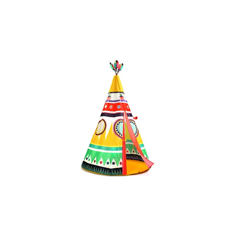
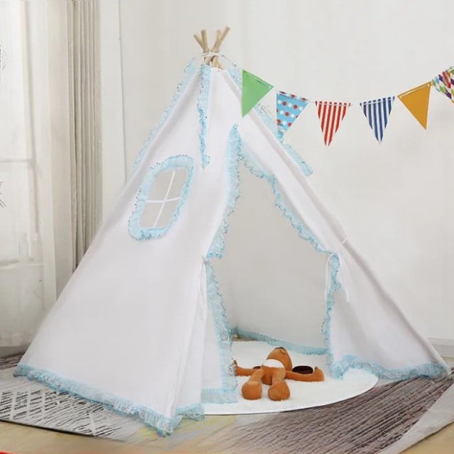
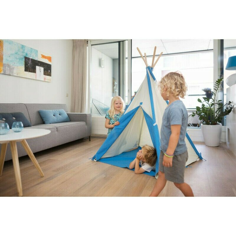
Alte produse din aceeasi categorie:

Livrare rapida
oriunde in Romania si retur gratuit timp de minim 14 zile.
Plati sigure
ramburs sau cu cardul online, chiar si in rate fara dobanda.
Magazine verificate
si populare, cu peste 1 milion de produse disponibile oricand.
Suport tehnic
Ai o intrebare? Contacteaza-ne telefonic sau trimite-ne un mesaj.
Suntem cel mai mare agregator de magazine online si produse la reducere din Romania functionand in sistem Search > Click > Buy.
- AXWELL SERV SRL
RO24613290 / J17/147/2018 -
Adresa:
Al. Strandului #3, Tecuci
805300, Galati, Romania - Telefon: (+40) 748 400 200

© 2020 - 2025 Toate drepturile rezervate XSales.ro Reduceri Romania
Scrie parerea ta
Cort tip indian pentru copii, Wigwam, 120 x 120 x 150 cm, Roz, EcoToys
Ai cumparat produsul Cort tip indian pentru copii, Wigwam, 120 x 120 x 150 cm, Roz, EcoToys ?
Lasa o nota si parerea ta completand formularul alaturat.
.bd-grid { display: grid; display: grid; grid-template-columns: repeat(3, minmax(0, 1fr)); row-gap: 50px; column-gap: 50px; justify-items: center; text-align: center; } @media screen and (max-width: 600px) { .bd-grid { display: grid; grid-template-columns: repeat(1, minmax(0, 1fr)); } } .bd-grid-s { display: grid; display: grid; grid-template-columns: repeat(2, minmax(0, 1fr)); row-gap: 50px; column-gap: 50px; justify-items: center; text-align: center; align-items: center; } @media screen and (max-width: 600px) { .bd-grid-s { display: grid; grid-template-columns: repeat(1, minmax(0, 1fr)); } } Cort tip indian pentru copii, Wigwam cortul pentru copii este locul ideal pentru joaca, atat in casa, cat si afara. Poate fi amplasat in camera copiiilor, pe balcon, terasa, sau in gradina; betele din care este construit cortul, sunt din lemn de pin. Betele se leaga in partea superioarăa cu o sfoara de fixare; constructia usoara si simplitatea cu care se asambleaza, permit mutarea acestuia in orice loc; uniti doua bete si introduceti-le in tunelurile din material. Apoi mai trebuie doar, sa legati betele. Fereastra se afla pe peretele lateral. Distractie si imaginatie! Pentru ca nu exista copil care sa nu-si fi construit vreodata un cort sub a carei cupola sa fii luat nastere povesti fantastice asa cum numai imaginatia copiilor o pot crea, echipa noastra s-a gandit sa de-a o mana de ajutor copilasilor, punandu-va la dispozitie o colectie de corturi pentru copii in stil indian potrivite atat pentru fetite cat si pentru baietei. Asa numilele “teeppe tents” sunt usor de montat si depozitat (se strang in cateva secunde), stabile (daca sunt montate corespunzator) si au acea capacitate de a da starni imaginatia copiilor dand nastere la sute de povesti cu zane, zmei, bucatari, astronauti si cate si mai cate. Import de stiut ar fi insa ca un astfel de cort poate deveni foarte repede jucaria prferata a copilului d-voastra. Simplitate si confort! Creati-le copiiilor propriul sanctuar in casa. Cortul pentru copii il puteti amenaja in camera de zi, sau in camera copiilor, insa, in timpul zilelor calde de vara, il puteti plasa si in gradina, sau pe terasa. Cortul pentru copii, este realizat din materiale de calitate. Asamblarea acestuia este foarte uaoar si simpla – va va lua doar cateva minute. Asadar, creati-le copiiilor un spatiu confortabil, de care nu se vor satura asa de repede. SETUL CONTINE: cadrul (betele din lemn); cortul teepee de culoare roz; elementele de imbinare. DIMENSIUNI: Lungime: 120 cm; Latime: 120 cm; Inaltime: 150 cm. .bd-grid { display: grid; display: grid; grid-template-columns: repeat(3, minmax(0, 1fr)); row-gap: 50px; column-gap: 50px; justify-items: center; text-align: center; } @media screen and (max-width: 600px) { .bd-grid { display: grid; grid-template-columns: repeat(1, minmax(0, 1fr)); } } .bd-grid-s { display: grid; display: grid; grid-template-columns: repeat(2, minmax(0, 1fr)); row-gap: 50px; column-gap: 50px; justify-items: center; text-align: center; align-items: center; } @media screen and (max-width: 600px) { .bd-grid-s { display: grid; grid-template-columns: repeat(1, minmax(0, 1fr)); } } .bd-grid { display: grid; display: grid; grid-template-columns: repeat(3, minmax(0, 1fr)); row-gap: 50px; column-gap: 50px; justify-items: center; text-align: center; } @media screen and (max-width: 600px) { .bd-grid { display: grid; grid-template-columns: repeat(1, minmax(0, 1fr)); } } .bd-grid-s { display: grid; display: grid; grid-template-columns: repeat(2, minmax(0, 1fr)); row-gap: 50px; column-gap: 50px; justify-items: center; text-align: center; align-items: center; } @media screen and (max-width: 600px) { .bd-grid-s { display: grid; grid-template-columns: repeat(1, minmax(0, 1fr)); } } .bd-grid { display: grid; display: grid; grid-template-columns: repeat(3, minmax(0, 1fr)); row-gap: 50px; column-gap: 50px; justify-items: center; text-align: center; } @media screen and (max-width: 600px) { .bd-grid { display: grid; grid-template-columns: repeat(1, minmax(0, 1fr)); } } .bd-grid-s { display: grid; display: grid; grid-template-columns: repeat(2, minmax(0, 1fr)); row-gap: 50px; column-gap: 50px; justify-items: center; text-align: center; align-items: center; } @media screen and (max-width: 600px) { .bd-grid-s { display: grid; grid-template-columns: repeat(1, minmax(0, 1fr)); } } .bd-grid { display: grid; display: grid; grid-template-columns: repeat(3, minmax(0, 1fr)); row-gap: 50px; column-gap: 50px; justify-items: center; text-align: center; } @media screen and (max-width: 600px) { .bd-grid { display: grid; grid-template-columns: repeat(1, minmax(0, 1fr)); } } .bd-grid-s { display: grid; display: grid; grid-template-columns: repeat(2, minmax(0, 1fr)); row-gap: 50px; column-gap: 50px; justify-items: center; text-align: center; align-items: center; } @media screen and (max-width: 600px) { .bd-grid-s { display: grid; grid-template-columns: repeat(1, minmax(0, 1fr)); } } .bd-grid { display: grid; display: grid; grid-template-columns: repeat(3, minmax(0, 1fr)); row-gap: 50px; column-gap: 50px; justify-items: center; text-align: center; } @media screen and (max-width: 600px) { .bd-grid { display: grid; grid-template-columns: repeat(1, minmax(0, 1fr)); } } .bd-grid-s { display: grid; display: grid; grid-template-columns: repeat(2, minmax(0, 1fr)); row-gap: 50px; column-gap: 50px; justify-items: center; text-align: center; align-items: center; } @media screen and (max-width: 600px) { .bd-grid-s { display: grid; grid-template-columns: repeat(1, minmax(0, 1fr)); } } .bd-grid { display: grid; display: grid; grid-template-columns: repeat(3, minmax(0, 1fr)); row-gap: 50px; column-gap: 50px; justify-items: center; text-align: center; } @media screen and (max-width: 600px) { .bd-grid { display: grid; grid-template-columns: repeat(1, minmax(0, 1fr)); } } .bd-grid-s { display: grid; display: grid; grid-template-columns: repeat(2, minmax(0, 1fr)); row-gap: 50px; column-gap: 50px; justify-items: center; text-align: center; align-items: center; } @media screen and (max-width: 600px) { .bd-grid-s { display: grid; grid-template-columns: repeat(1, minmax(0, 1fr)); } } .bd-grid { display: grid; display: grid; grid-template-columns: repeat(3, minmax(0, 1fr)); row-gap: 50px; column-gap: 50px; justify-items: center; text-align: center; } @media screen and (max-width: 600px) { .bd-grid { display: grid; grid-template-columns: repeat(1, minmax(0, 1fr)); } } .bd-grid-s { display: grid; display: grid; grid-template-columns: repeat(2, minmax(0, 1fr)); row-gap: 50px; column-gap: 50px; justify-items: center; text-align: center; align-items: center; } @media screen and (max-width: 600px) { .bd-grid-s { display: grid; grid-template-columns: repeat(1, minmax(0, 1fr)); } } .bd-grid { display: grid; display: grid; grid-template-columns: repeat(3, minmax(0, 1fr)); row-gap: 50px; column-gap: 50px; justify-items: center; text-align: center; } @media screen and (max-width: 600px) { .bd-grid { display: grid; grid-template-columns: repeat(1, minmax(0, 1fr)); } } .bd-grid-s { display: grid; display: grid; grid-template-columns: repeat(2, minmax(0, 1fr)); row-gap: 50px; column-gap: 50px; justify-items: center; text-align: center; align-items: center; } @media screen and (max-width: 600px) { .bd-grid-s { display: grid; grid-template-columns: repeat(1, minmax(0, 1fr)); } } .bd-grid { display: grid; display: grid; grid-template-columns: repeat(3, minmax(0, 1fr)); row-gap: 50px; column-gap: 50px; justify-items: center; text-align: center; } @media screen and (max-width: 600px) { .bd-grid { display: grid; grid-template-columns: repeat(1, minmax(0, 1fr)); } } .bd-grid-s { display: grid; display: grid; grid-template-columns: repeat(2, minmax(0, 1fr)); row-gap: 50px; column-gap: 50px; justify-items: center; text-align: center; align-items: center; } @media screen and (max-width: 600px) { .bd-grid-s { display: grid; grid-template-columns: repeat(1, minmax(0, 1fr)); } } .bd-grid { display: grid; display: grid; grid-template-columns: repeat(3, minmax(0, 1fr)); row-gap: 50px; column-gap: 50px; justify-items: center; text-align: center; } @media screen and (max-width: 600px) { .bd-grid { display: grid; grid-template-columns: repeat(1, minmax(0, 1fr)); } } .bd-grid-s { display: grid; display: grid; grid-template-columns: repeat(2, minmax(0, 1fr)); row-gap: 50px; column-gap: 50px; justify-items: center; text-align: center; align-items: center; } @media screen and (max-width: 600px) { .bd-grid-s { display: grid; grid-template-columns: repeat(1, minmax(0, 1fr)); } } .bd-grid { display: grid; display: grid; grid-template-columns: repeat(3, minmax(0, 1fr)); row-gap: 50px; column-gap: 50px; justify-items: center; text-align: center; } @media screen and (max-width: 600px) { .bd-grid { display: grid; grid-template-columns: repeat(1, minmax(0, 1fr)); } } .bd-grid-s { display: grid; display: grid; grid-template-columns: repeat(2, minmax(0, 1fr)); row-gap: 50px; column-gap: 50px; justify-items: center; text-align: center; align-items: center; } @media screen and (max-width: 600px) { .bd-grid-s { display: grid; grid-template-columns: repeat(1, minmax(0, 1fr)); } } .bd-grid { display: grid; display: grid; grid-template-columns: repeat(3, minmax(0, 1fr)); row-gap: 50px; column-gap: 50px; justify-items: center; text-align: center; } @media screen and (max-width: 600px) { .bd-grid { display: grid; grid-template-columns: repeat(1, minmax(0, 1fr)); } } .bd-grid-s { display: grid; display: grid; grid-template-columns: repeat(2, minmax(0, 1fr)); row-gap: 50px; column-gap: 50px; justify-items: center; text-align: center; align-items: center; } @media screen and (max-width: 600px) { .bd-grid-s { display: grid; grid-template-columns: repeat(1, minmax(0, 1fr)); } } .bd-grid { display: grid; display: grid; grid-template-columns: repeat(3, minmax(0, 1fr)); row-gap: 50px; column-gap: 50px; justify-items: center; text-align: center; } @media screen and (max-width: 600px) { .bd-grid { display: grid; grid-template-columns: repeat(1, minmax(0, 1fr)); } } .bd-grid-s { display: grid; display: grid; grid-template-columns: repeat(2, minmax(0, 1fr)); row-gap: 50px; column-gap: 50px; justify-items: center; text-align: center; align-items: center; } @media screen and (max-width: 600px) { .bd-grid-s { display: grid; grid-template-columns: repeat(1, minmax(0, 1fr)); } } .bd-grid { display: grid; display: grid; grid-template-columns: repeat(3, minmax(0, 1fr)); row-gap: 50px; column-gap: 50px; justify-items: center; text-align: center; } @media screen and (max-width: 600px) { .bd-grid { display: grid; grid-template-columns: repeat(1, minmax(0, 1fr)); } } .bd-grid-s { display: grid; display: grid; grid-template-columns: repeat(2, minmax(0, 1fr)); row-gap: 50px; column-gap: 50px; justify-items: center; text-align: center; align-items: center; } @media screen and (max-width: 600px) { .bd-grid-s { display: grid; grid-template-columns: repeat(1, minmax(0, 1fr)); } } .bd-grid { display: grid; display: grid; grid-template-columns: repeat(3, minmax(0, 1fr)); row-gap: 50px; column-gap: 50px; justify-items: center; text-align: center; } @media screen and (max-width: 600px) { .bd-grid { display: grid; grid-template-columns: repeat(1, minmax(0, 1fr)); } } .bd-grid-s { display: grid; display: grid; grid-template-columns: repeat(2, minmax(0, 1fr)); row-gap: 50px; column-gap: 50px; justify-items: center; text-align: center; align-items: center; } @media screen and (max-width: 600px) { .bd-grid-s { display: grid; grid-template-columns: repeat(1, minmax(0, 1fr)); } } .bd-grid { display: grid; display: grid; grid-template-columns: repeat(3, minmax(0, 1fr)); row-gap: 50px; column-gap: 50px; justify-items: center; text-align: center; } @media screen and (max-width: 600px) { .bd-grid { display: grid; grid-template-columns: repeat(1, minmax(0, 1fr)); } } .bd-grid-s { display: grid; display: grid; grid-template-columns: repeat(2, minmax(0, 1fr)); row-gap: 50px; column-gap: 50px; justify-items: center; text-align: center; align-items: center; } @media screen and (max-width: 600px) { .bd-grid-s { display: grid; grid-template-columns: repeat(1, minmax(0, 1fr)); } } .bd-grid { display: grid; display: grid; grid-template-columns: repeat(3, minmax(0, 1fr)); row-gap: 50px; column-gap: 50px; justify-items: center; text-align: center; } @media screen and (max-width: 600px) { .bd-grid { display: grid; grid-template-columns: repeat(1, minmax(0, 1fr)); } } .bd-grid-s { display: grid; display: grid; grid-template-columns: repeat(2, minmax(0, 1fr)); row-gap: 50px; column-gap: 50px; justify-items: center; text-align: center; align-items: center; } @media screen and (max-width: 600px) { .bd-grid-s { display: grid; grid-template-columns: repeat(1, minmax(0, 1fr)); } } .bd-grid { display: grid; display: grid; grid-template-columns: repeat(3, minmax(0, 1fr)); row-gap: 50px; column-gap: 50px; justify-items: center; text-align: center; } @media screen and (max-width: 600px) { .bd-grid { display: grid; grid-template-columns: repeat(1, minmax(0, 1fr)); } } .bd-grid-s { display: grid; display: grid; grid-template-columns: repeat(2, minmax(0, 1fr)); row-gap: 50px; column-gap: 50px; justify-items: center; text-align: center; align-items: center; } @media screen and (max-width: 600px) { .bd-grid-s { display: grid; grid-template-columns: repeat(1, minmax(0, 1fr)); } } .bd-grid { display: grid; display: grid; grid-template-columns: repeat(3, minmax(0, 1fr)); row-gap: 50px; column-gap: 50px; justify-items: center; text-align: center; } @media screen and (max-width: 600px) { .bd-grid { display: grid; grid-template-columns: repeat(1, minmax(0, 1fr)); } } .bd-grid-s { display: grid; display: grid; grid-template-columns: repeat(2, minmax(0, 1fr)); row-gap: 50px; column-gap: 50px; justify-items: center; text-align: center; align-items: center; } @media screen and (max-width: 600px) { .bd-grid-s { display: grid; grid-template-columns: repeat(1, minmax(0, 1fr)); } } .bd-grid { display: grid; display: grid; grid-template-columns: repeat(3, minmax(0, 1fr)); row-gap: 50px; column-gap: 50px; justify-items: center; text-align: center; } @media screen and (max-width: 600px) { .bd-grid { display: grid; grid-template-columns: repeat(1, minmax(0, 1fr)); } } .bd-grid-s { display: grid; display: grid; grid-template-columns: repeat(2, minmax(0, 1fr)); row-gap: 50px; column-gap: 50px; justify-items: center; text-align: center; align-items: center; } @media screen and (max-width: 600px) { .bd-grid-s { display: grid; grid-template-columns: repeat(1, minmax(0, 1fr)); } } .bd-grid { display: grid; display: grid; grid-template-columns: repeat(3, minmax(0, 1fr)); row-gap: 50px; column-gap: 50px; justify-items: center; text-align: center; } @media screen and (max-width: 600px) { .bd-grid { display: grid; grid-template-columns: repeat(1, minmax(0, 1fr)); } } .bd-grid-s { display: grid; display: grid; grid-template-columns: repeat(2, minmax(0, 1fr)); row-gap: 50px; column-gap: 50px; justify-items: center; text-align: center; align-items: center; } @media screen and (max-width: 600px) { .bd-grid-s { display: grid; grid-template-columns: repeat(1, minmax(0, 1fr)); } } .bd-grid { display: grid; display: grid; grid-template-columns: repeat(3, minmax(0, 1fr)); row-gap: 50px; column-gap: 50px; justify-items: center; text-align: center; } @media screen and (max-width: 600px) { .bd-grid { display: grid; grid-template-columns: repeat(1, minmax(0, 1fr)); } } .bd-grid-s { display: grid; display: grid; grid-template-columns: repeat(2, minmax(0, 1fr)); row-gap: 50px; column-gap: 50px; justify-items: center; text-align: center; align-items: center; } @media screen and (max-width: 600px) { .bd-grid-s { display: grid; grid-template-columns: repeat(1, minmax(0, 1fr)); } } .bd-grid { display: grid; display: grid; grid-template-columns: repeat(3, minmax(0, 1fr)); row-gap: 50px; column-gap: 50px; justify-items: center; text-align: center; } @media screen and (max-width: 600px) { .bd-grid { display: grid; grid-template-columns: repeat(1, minmax(0, 1fr)); } } .bd-grid-s { display: grid; display: grid; grid-template-columns: repeat(2, minmax(0, 1fr)); row-gap: 50px; column-gap: 50px; justify-items: center; text-align: center; align-items: center; } @media screen and (max-width: 600px) { .bd-grid-s { display: grid; grid-template-columns: repeat(1, minmax(0, 1fr)); } } .bd-grid { display: grid; display: grid; grid-template-columns: repeat(3, minmax(0, 1fr)); row-gap: 50px; column-gap: 50px; justify-items: center; text-align: center; } @media screen and (max-width: 600px) { .bd-grid { display: grid; grid-template-columns: repeat(1, minmax(0, 1fr)); } } .bd-grid-s { display: grid; display: grid; grid-template-columns: repeat(2, minmax(0, 1fr)); row-gap: 50px; column-gap: 50px; justify-items: center; text-align: center; align-items: center; } @media screen and (max-width: 600px) { .bd-grid-s { display: grid; grid-template-columns: repeat(1, minmax(0, 1fr)); } } .bd-grid { display: grid; display: grid; grid-template-columns: repeat(3, minmax(0, 1fr)); row-gap: 50px; column-gap: 50px; justify-items: center; text-align: center; } @media screen and (max-width: 600px) { .bd-grid { display: grid; grid-template-columns: repeat(1, minmax(0, 1fr)); } } .bd-grid-s { display: grid; display: grid; grid-template-columns: repeat(2, minmax(0, 1fr)); row-gap: 50px; column-gap: 50px; justify-items: center; text-align: center; align-items: center; } @media screen and (max-width: 600px) { .bd-grid-s { display: grid; grid-template-columns: repeat(1, minmax(0, 1fr)); } } .bd-grid { display: grid; display: grid; grid-template-columns: repeat(3, minmax(0, 1fr)); row-gap: 50px; column-gap: 50px; justify-items: center; text-align: center; } @media screen and (max-width: 600px) { .bd-grid { display: grid; grid-template-columns: repeat(1, minmax(0, 1fr)); } } .bd-grid-s { display: grid; display: grid; grid-template-columns: repeat(2, minmax(0, 1fr)); row-gap: 50px; column-gap: 50px; justify-items: center; text-align: center; align-items: center; } @media screen and (max-width: 600px) { .bd-grid-s { display: grid; grid-template-columns: repeat(1, minmax(0, 1fr)); } } .bd-grid { display: grid; display: grid; grid-template-columns: repeat(3, minmax(0, 1fr)); row-gap: 50px; column-gap: 50px; justify-items: center; text-align: center; } @media screen and (max-width: 600px) { .bd-grid { display: grid; grid-template-columns: repeat(1, minmax(0, 1fr)); } } .bd-grid-s { display: grid; display: grid; grid-template-columns: repeat(2, minmax(0, 1fr)); row-gap: 50px; column-gap: 50px; justify-items: center; text-align: center; align-items: center; } @media screen and (max-width: 600px) { .bd-grid-s { display: grid; grid-template-columns: repeat(1, minmax(0, 1fr)); } } .bd-grid { display: grid; display: grid; grid-template-columns: repeat(3, minmax(0, 1fr)); row-gap: 50px; column-gap: 50px; justify-items: center; text-align: center; } @media screen and (max-width: 600px) { .bd-grid { display: grid; grid-template-columns: repeat(1, minmax(0, 1fr)); } } .bd-grid-s { display: grid; display: grid; grid-template-columns: repeat(2, minmax(0, 1fr)); row-gap: 50px; column-gap: 50px; justify-items: center; text-align: center; align-items: center; } @media screen and (max-width: 600px) { .bd-grid-s { display: grid; grid-template-columns: repeat(1, minmax(0, 1fr)); } } .bd-grid { display: grid; display: grid; grid-template-columns: repeat(3, minmax(0, 1fr)); row-gap: 50px; column-gap: 50px; justify-items: center; text-align: center; } @media screen and (max-width: 600px) { .bd-grid { display: grid; grid-template-columns: repeat(1, minmax(0, 1fr)); } } .bd-grid-s { display: grid; display: grid; grid-template-columns: repeat(2, minmax(0, 1fr)); row-gap: 50px; column-gap: 50px; justify-items: center; text-align: center; align-items: center; } @media screen and (max-width: 600px) { .bd-grid-s { display: grid; grid-template-columns: repeat(1, minmax(0, 1fr)); } } .bd-grid { display: grid; display: grid; grid-template-columns: repeat(3, minmax(0, 1fr)); row-gap: 50px; column-gap: 50px; justify-items: center; text-align: center; } @media screen and (max-width: 600px) { .bd-grid { display: grid; grid-template-columns: repeat(1, minmax(0, 1fr)); } } .bd-grid-s { display: grid; display: grid; grid-template-columns: repeat(2, minmax(0, 1fr)); row-gap: 50px; column-gap: 50px; justify-items: center; text-align: center; align-items: center; } @media screen and (max-width: 600px) { .bd-grid-s { display: grid; grid-template-columns: repeat(1, minmax(0, 1fr)); } } .bd-grid { display: grid; display: grid; grid-template-columns: repeat(3, minmax(0, 1fr)); row-gap: 50px; column-gap: 50px; justify-items: center; text-align: center; } @media screen and (max-width: 600px) { .bd-grid { display: grid; grid-template-columns: repeat(1, minmax(0, 1fr)); } } .bd-grid-s { display: grid; display: grid; grid-template-columns: repeat(2, minmax(0, 1fr)); row-gap: 50px; column-gap: 50px; justify-items: center; text-align: center; align-items: center; } @media screen and (max-width: 600px) { .bd-grid-s { display: grid; grid-template-columns: repeat(1, minmax(0, 1fr)); } } .bd-grid { display: grid; display: grid; grid-template-columns: repeat(3, minmax(0, 1fr)); row-gap: 50px; column-gap: 50px; justify-items: center; text-align: center; } @media screen and (max-width: 600px) { .bd-grid { display: grid; grid-template-columns: repeat(1, minmax(0, 1fr)); } } .bd-grid-s { display: grid; display: grid; grid-template-columns: repeat(2, minmax(0, 1fr)); row-gap: 50px; column-gap: 50px; justify-items: center; text-align: center; align-items: center; } @media screen and (max-width: 600px) { .bd-grid-s { display: grid; grid-template-columns: repeat(1, minmax(0, 1fr)); } } .bd-grid { display: grid; display: grid; grid-template-columns: repeat(3, minmax(0, 1fr)); row-gap: 50px; column-gap: 50px; justify-items: center; text-align: center; } @media screen and (max-width: 600px) { .bd-grid { display: grid; grid-template-columns: repeat(1, minmax(0, 1fr)); } } .bd-grid-s { display: grid; display: grid; grid-template-columns: repeat(2, minmax(0, 1fr)); row-gap: 50px; column-gap: 50px; justify-items: center; text-align: center; align-items: center; } @media screen and (max-width: 600px) { .bd-grid-s { display: grid; grid-template-columns: repeat(1, minmax(0, 1fr)); } } .bd-grid { display: grid; display: grid; grid-template-columns: repeat(3, minmax(0, 1fr)); row-gap: 50px; column-gap: 50px; justify-items: center; text-align: center; } @media screen and (max-width: 600px) { .bd-grid { display: grid; grid-template-columns: repeat(1, minmax(0, 1fr)); } } .bd-grid-s { display: grid; display: grid; grid-template-columns: repeat(2, minmax(0, 1fr)); row-gap: 50px; column-gap: 50px; justify-items: center; text-align: center; align-items: center; } @media screen and (max-width: 600px) { .bd-grid-s { display: grid; grid-template-columns: repeat(1, minmax(0, 1fr)); } } .bd-grid { display: grid; display: grid; grid-template-columns: repeat(3, minmax(0, 1fr)); row-gap: 50px; column-gap: 50px; justify-items: center; text-align: center; } @media screen and (max-width: 600px) { .bd-grid { display: grid; grid-template-columns: repeat(1, minmax(0, 1fr)); } } .bd-grid-s { display: grid; display: grid; grid-template-columns: repeat(2, minmax(0, 1fr)); row-gap: 50px; column-gap: 50px; justify-items: center; text-align: center; align-items: center; } @media screen and (max-width: 600px) { .bd-grid-s { display: grid; grid-template-columns: repeat(1, minmax(0, 1fr)); } } .bd-grid { display: grid; display: grid; grid-template-columns: repeat(3, minmax(0, 1fr)); row-gap: 50px; column-gap: 50px; justify-items: center; text-align: center; } @media screen and (max-width: 600px) { .bd-grid { display: grid; grid-template-columns: repeat(1, minmax(0, 1fr)); } } .bd-grid-s { display: grid; display: grid; grid-template-columns: repeat(2, minmax(0, 1fr)); row-gap: 50px; column-gap: 50px; justify-items: center; text-align: center; align-items: center; } @media screen and (max-width: 600px) { .bd-grid-s { display: grid; grid-template-columns: repeat(1, minmax(0, 1fr)); } } .bd-grid { display: grid; display: grid; grid-template-columns: repeat(3, minmax(0, 1fr)); row-gap: 50px; column-gap: 50px; justify-items: center; text-align: center; } @media screen and (max-width: 600px) { .bd-grid { display: grid; grid-template-columns: repeat(1, minmax(0, 1fr)); } } .bd-grid-s { display: grid; display: grid; grid-template-columns: repeat(2, minmax(0, 1fr)); row-gap: 50px; column-gap: 50px; justify-items: center; text-align: center; align-items: center; } @media screen and (max-width: 600px) { .bd-grid-s { display: grid; grid-template-columns: repeat(1, minmax(0, 1fr)); } } .bd-grid { display: grid; display: grid; grid-template-columns: repeat(3, minmax(0, 1fr)); row-gap: 50px; column-gap: 50px; justify-items: center; text-align: center; } @media screen and (max-width: 600px) { .bd-grid { display: grid; grid-template-columns: repeat(1, minmax(0, 1fr)); } } .bd-grid-s { display: grid; display: grid; grid-template-columns: repeat(2, minmax(0, 1fr)); row-gap: 50px; column-gap: 50px; justify-items: center; text-align: center; align-items: center; } @media screen and (max-width: 600px) { .bd-grid-s { display: grid; grid-template-columns: repeat(1, minmax(0, 1fr)); } } .bd-grid { display: grid; display: grid; grid-template-columns: repeat(3, minmax(0, 1fr)); row-gap: 50px; column-gap: 50px; justify-items: center; text-align: center; } @media screen and (max-width: 600px) { .bd-grid { display: grid; grid-template-columns: repeat(1, minmax(0, 1fr)); } } .bd-grid-s { display: grid; display: grid; grid-template-columns: repeat(2, minmax(0, 1fr)); row-gap: 50px; column-gap: 50px; justify-items: center; text-align: center; align-items: center; } @media screen and (max-width: 600px) { .bd-grid-s { display: grid; grid-template-columns: repeat(1, minmax(0, 1fr)); } } .bd-grid { display: grid; display: grid; grid-template-columns: repeat(3, minmax(0, 1fr)); row-gap: 50px; column-gap: 50px; justify-items: center; text-align: center; } @media screen and (max-width: 600px) { .bd-grid { display: grid; grid-template-columns: repeat(1, minmax(0, 1fr)); } } .bd-grid-s { display: grid; display: grid; grid-template-columns: repeat(2, minmax(0, 1fr)); row-gap: 50px; column-gap: 50px; justify-items: center; text-align: center; align-items: center; } @media screen and (max-width: 600px) { .bd-grid-s { display: grid; grid-template-columns: repeat(1, minmax(0, 1fr)); } } .bd-grid { display: grid; display: grid; grid-template-columns: repeat(3, minmax(0, 1fr)); row-gap: 50px; column-gap: 50px; justify-items: center; text-align: center; } @media screen and (max-width: 600px) { .bd-grid { display: grid; grid-template-columns: repeat(1, minmax(0, 1fr)); } } .bd-grid-s { display: grid; display: grid; grid-template-columns: repeat(2, minmax(0, 1fr)); row-gap: 50px; column-gap: 50px; justify-items: center; text-align: center; align-items: center; } @media screen and (max-width: 600px) { .bd-grid-s { display: grid; grid-template-columns: repeat(1, minmax(0, 1fr)); } } .bd-grid { display: grid; display: grid; grid-template-columns: repeat(3, minmax(0, 1fr)); row-gap: 50px; column-gap: 50px; justify-items: center; text-align: center; } @media screen and (max-width: 600px) { .bd-grid { display: grid; grid-template-columns: repeat(1, minmax(0, 1fr)); } } .bd-grid-s { display: grid; display: grid; grid-template-columns: repeat(2, minmax(0, 1fr)); row-gap: 50px; column-gap: 50px; justify-items: center; text-align: center; align-items: center; } @media screen and (max-width: 600px) { .bd-grid-s { display: grid; grid-template-columns: repeat(1, minmax(0, 1fr)); } } .bd-grid { display: grid; display: grid; grid-template-columns: repeat(3, minmax(0, 1fr)); row-gap: 50px; column-gap: 50px; justify-items: center; text-align: center; } @media screen and (max-width: 600px) { .bd-grid { display: grid; grid-template-columns: repeat(1, minmax(0, 1fr)); } } .bd-grid-s { display: grid; display: grid; grid-template-columns: repeat(2, minmax(0, 1fr)); row-gap: 50px; column-gap: 50px; justify-items: center; text-align: center; align-items: center; } @media screen and (max-width: 600px) { .bd-grid-s { display: grid; grid-template-columns: repeat(1, minmax(0, 1fr)); } }
Acorda un calificativ